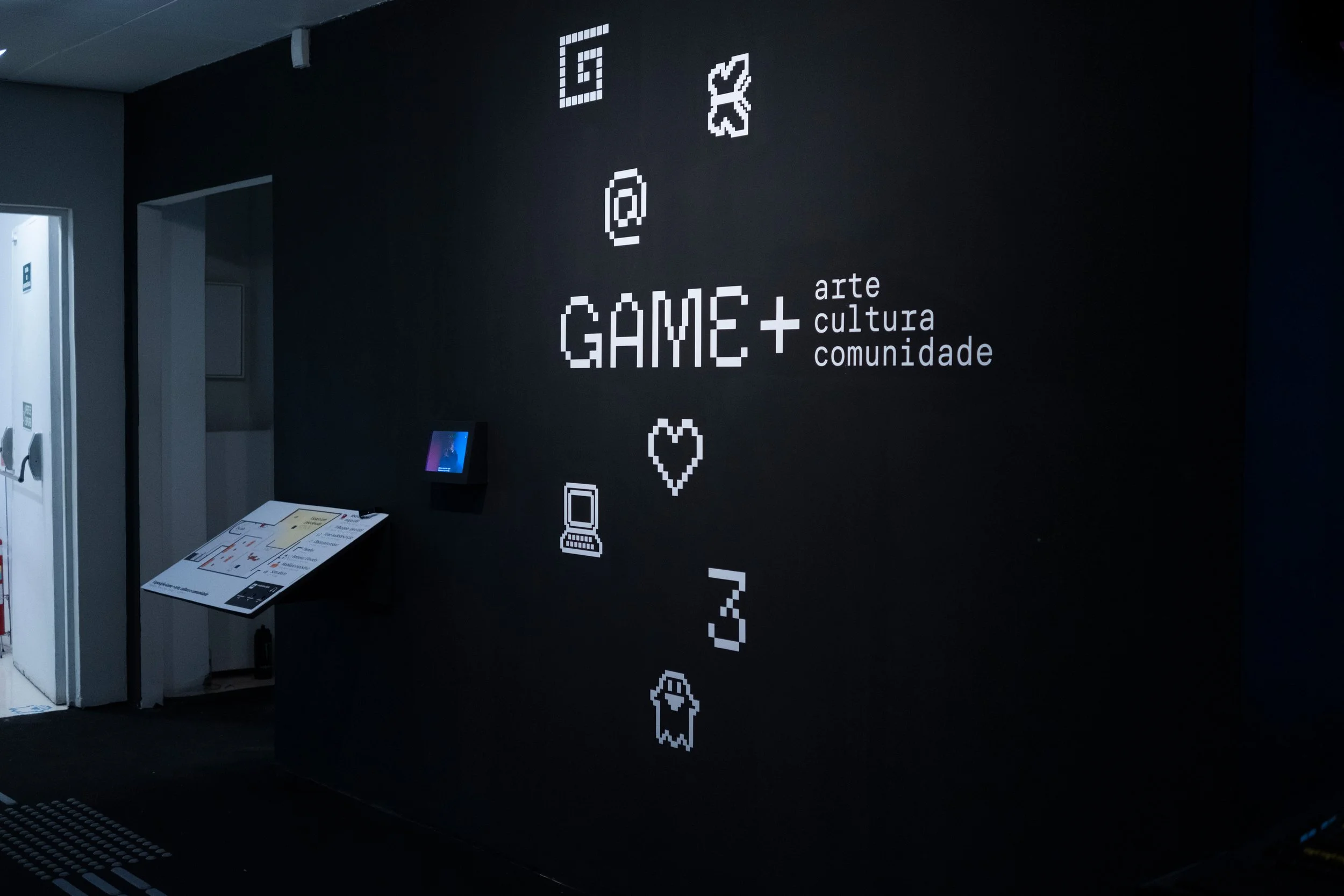
GAME+
arte, cultura e comunidade
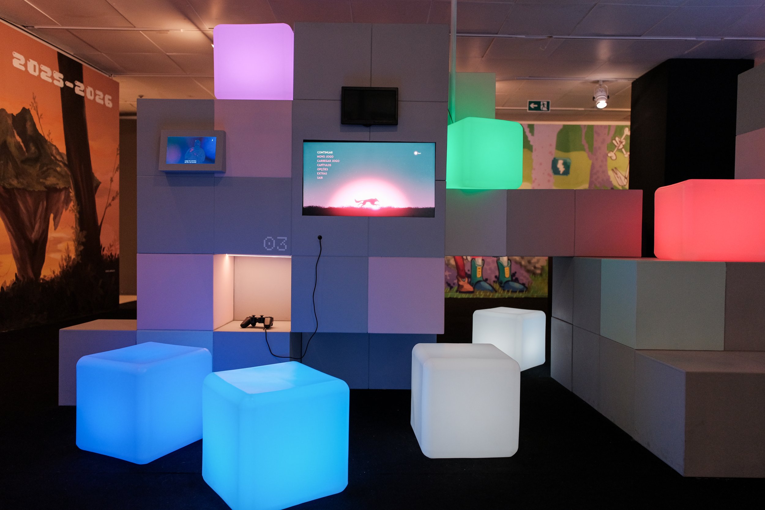
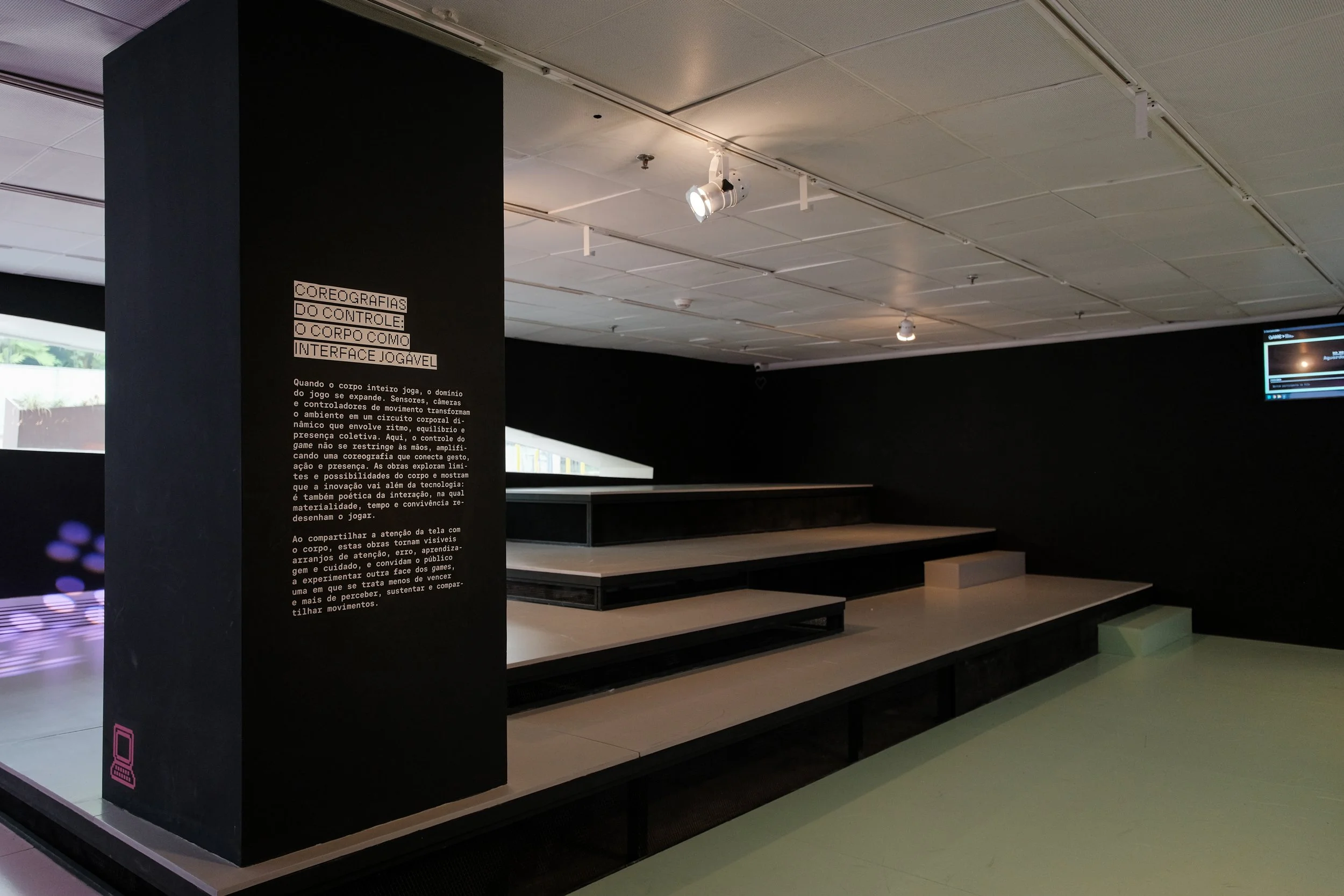
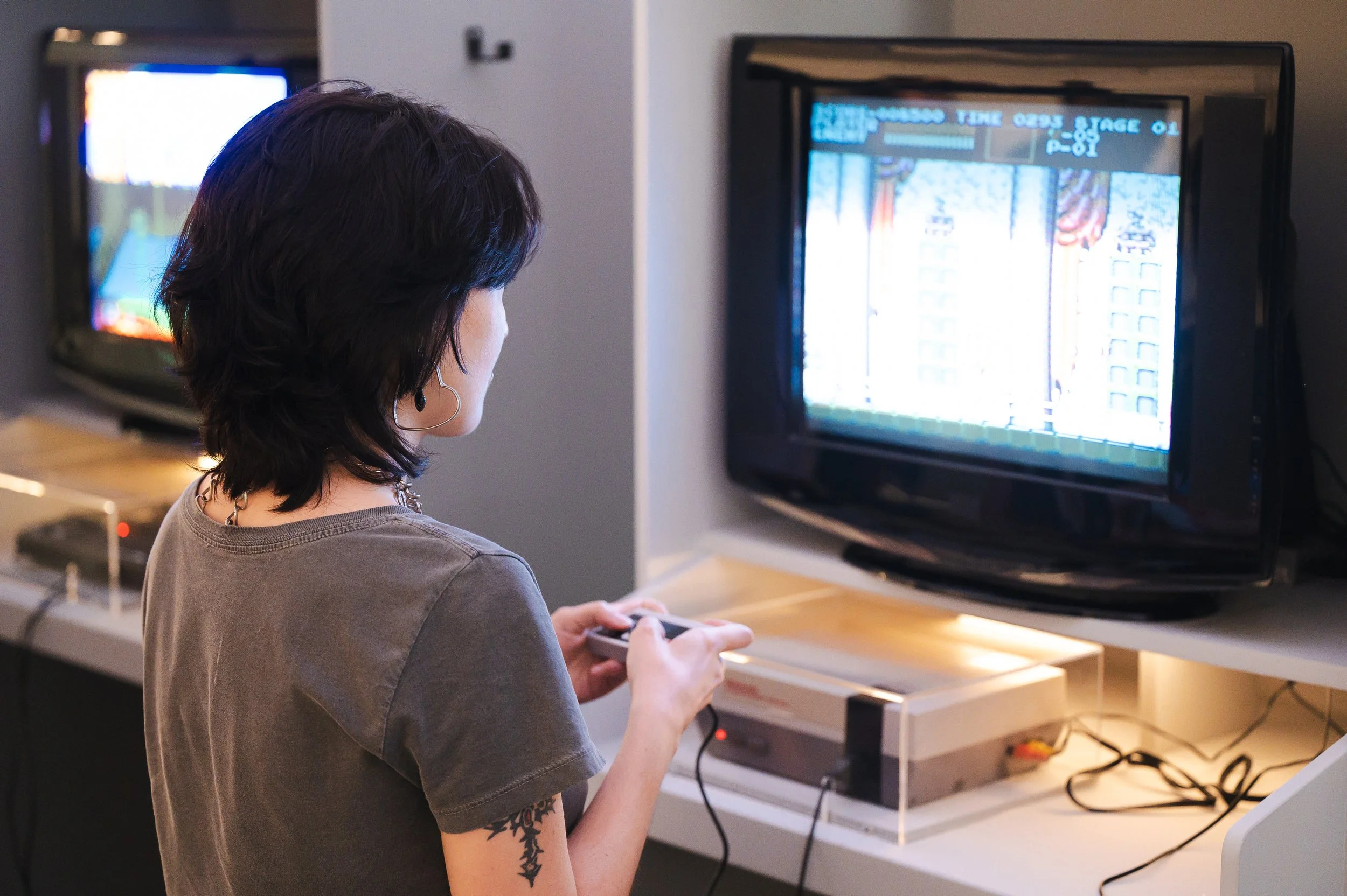
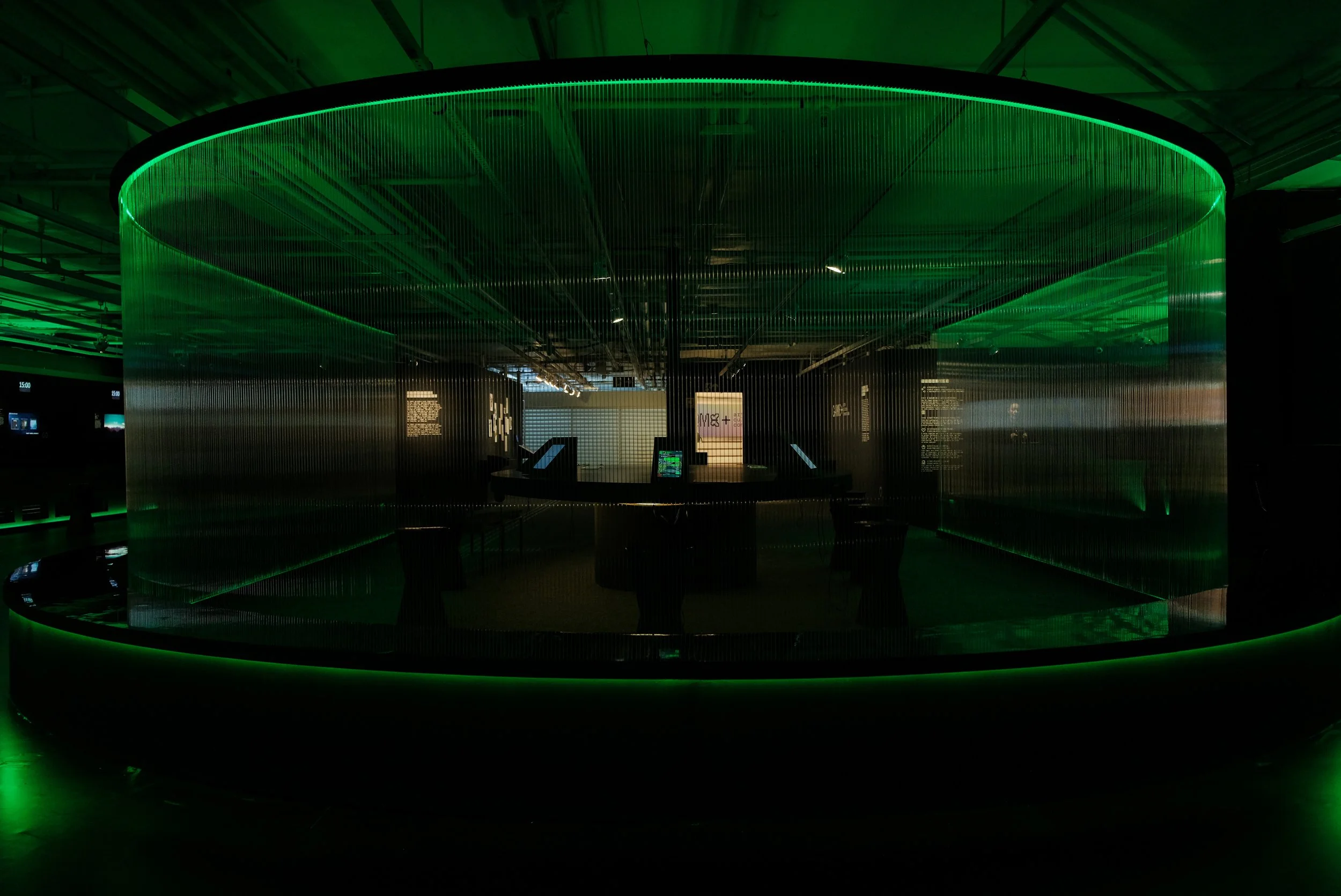
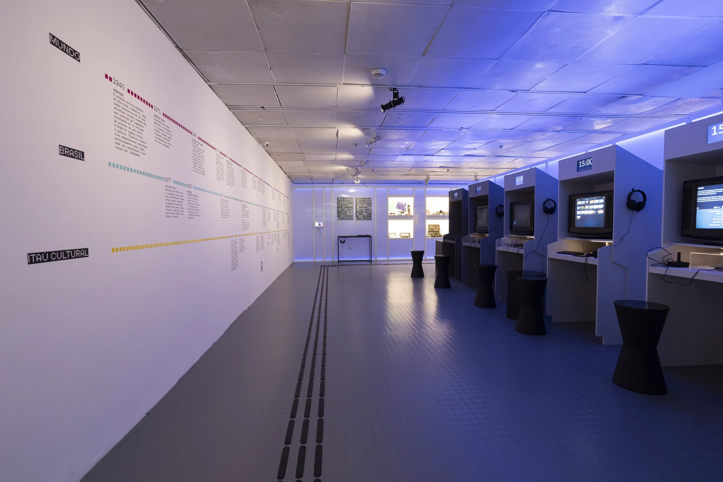
A exposição GAME+ arte, cultura e comunidade explora o impacto dos jogos na sociedade através dos eixos de história, educação e inovação. Com expografia de Renato Bolelli e Anísio Serafim, o espaço utiliza estruturas luminosas para criar uma atmosfera multidimensional.
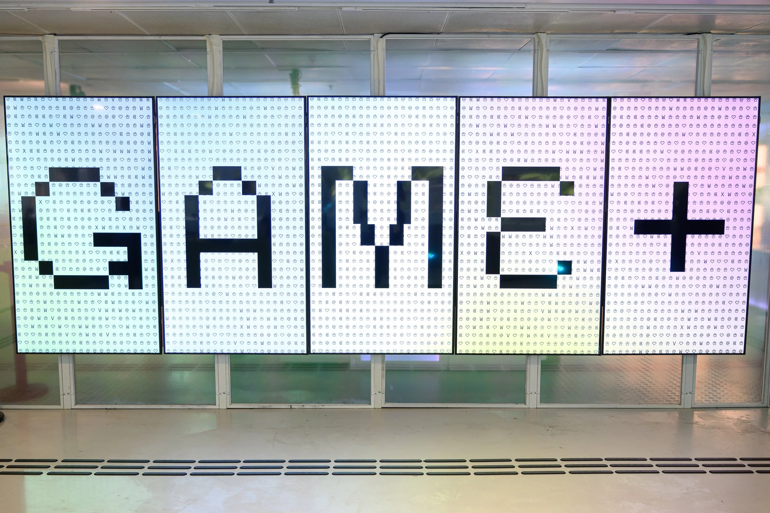
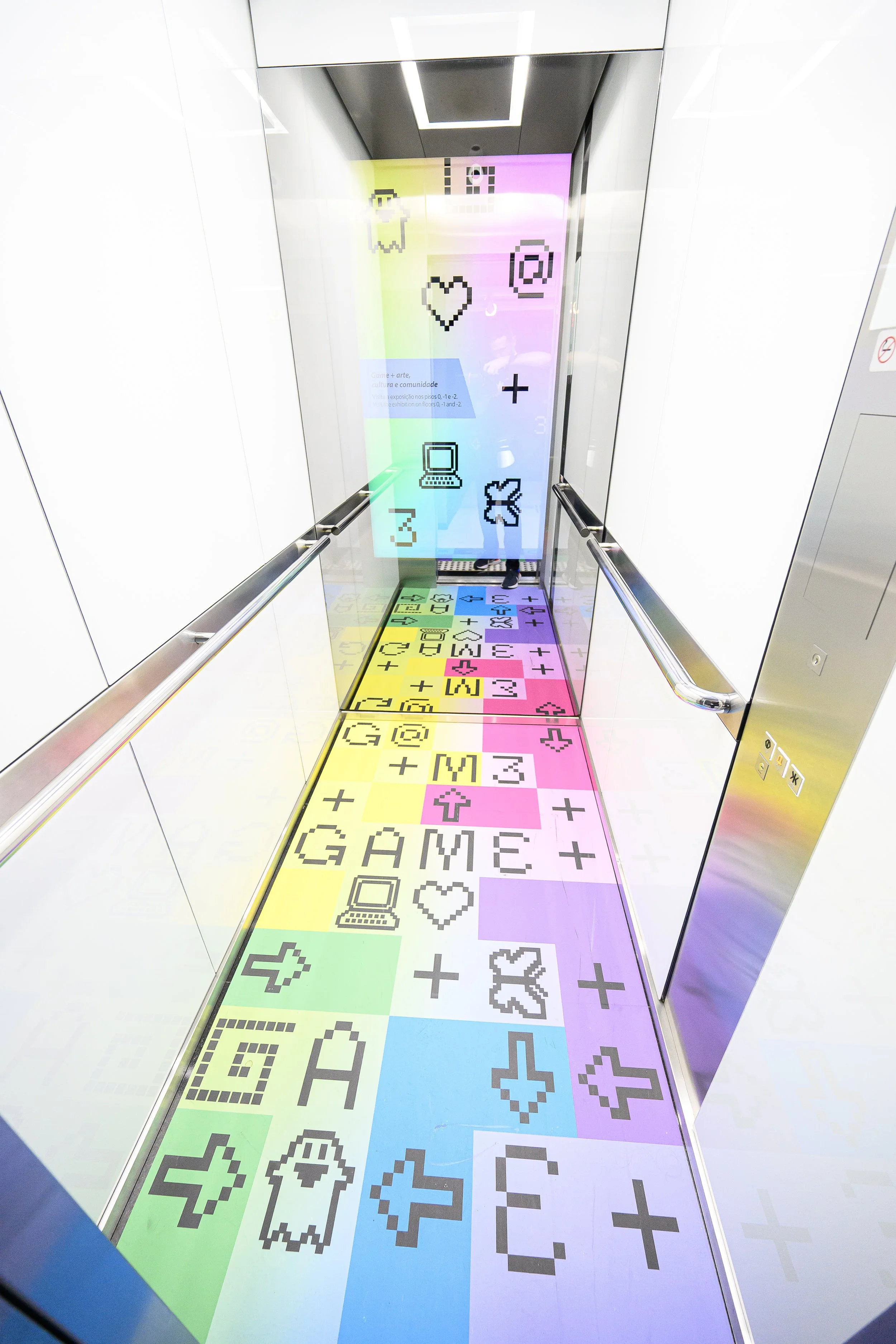
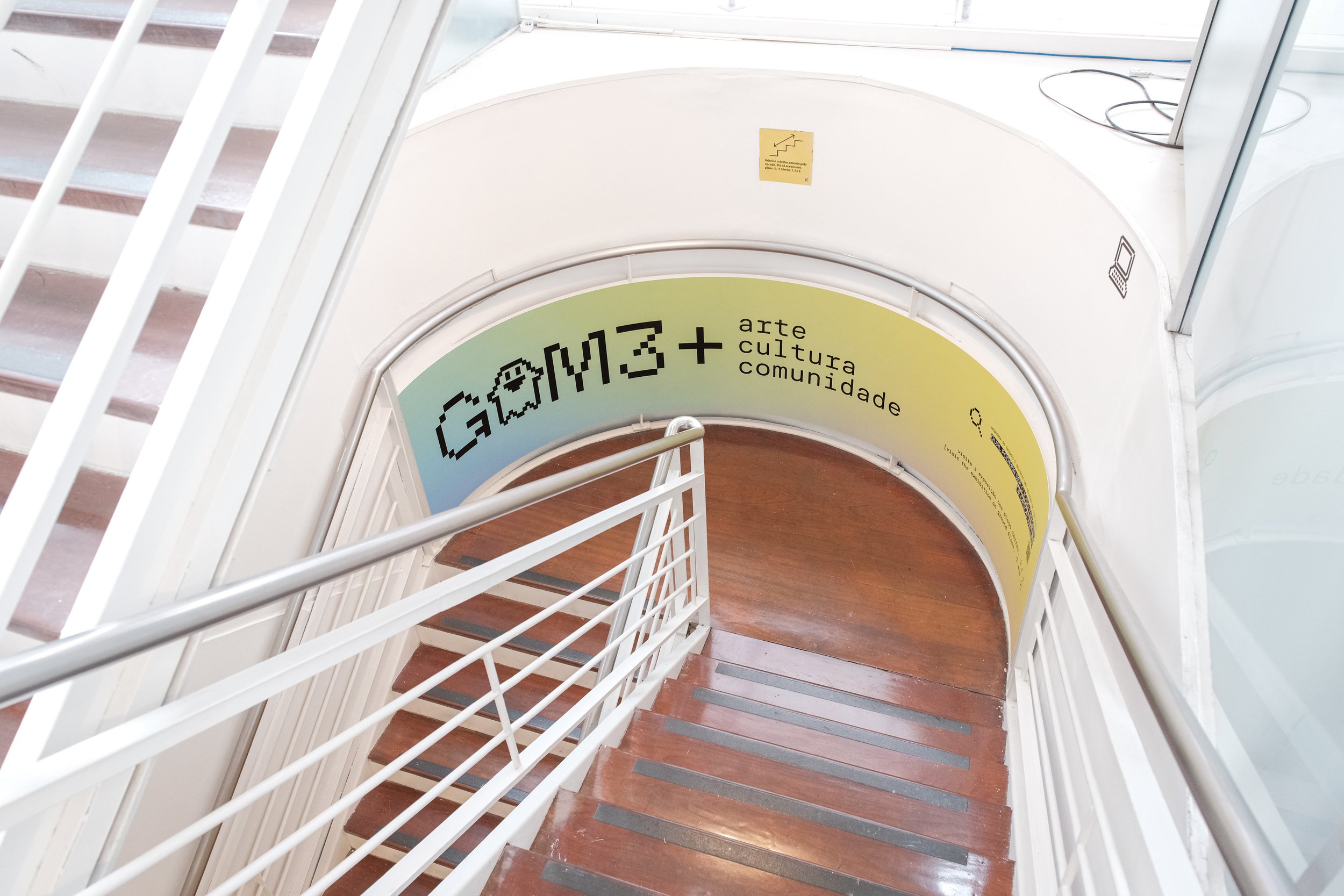
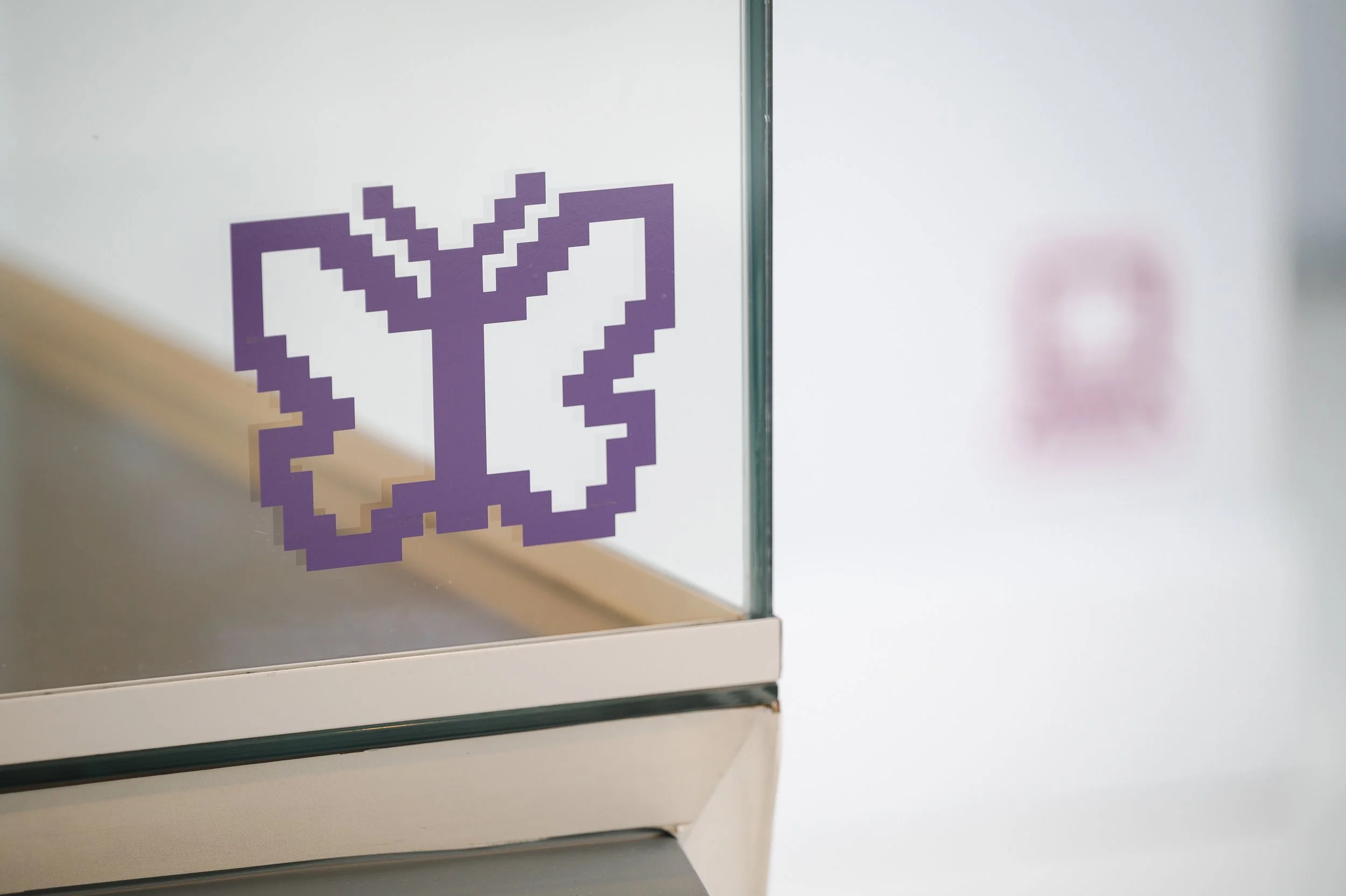
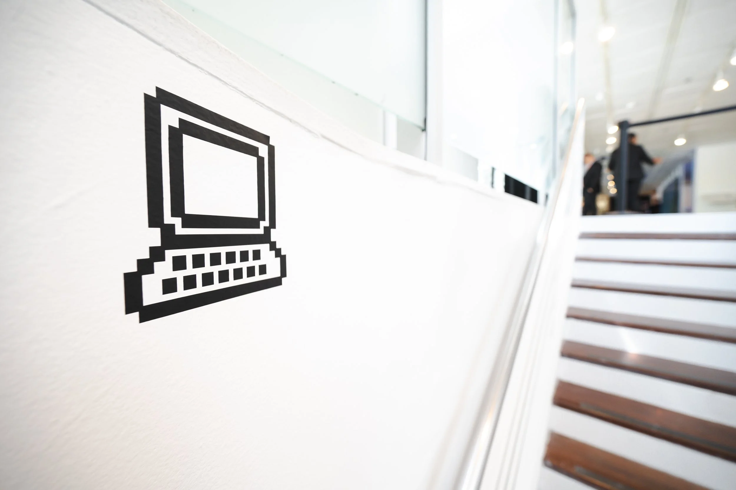
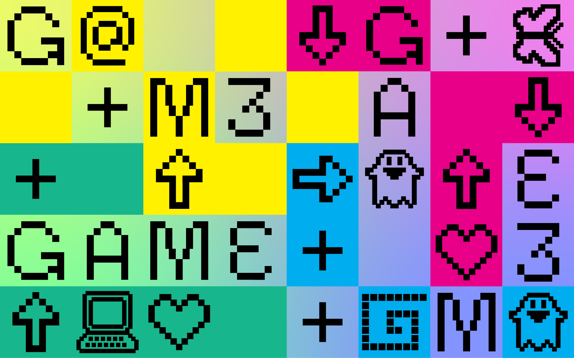
A identidade visual fundamenta-se no pixel, o elemento essencial que dá vida e movimento aos jogos. Sua geometria reflete os visores dos consoles clássicos, enquanto a paleta de cores narra o conceito da mostra: o preto ancora a força do "GAME"; o branco simboliza o sinal de "+" e a abertura do espectro de luz; e o gradiente representa a fusão entre arte, cultura e comunidade.
Na tipografia, a família CoFo Sans alterna entre as versões Pixel e Mono, unindo a estética digital ao conceito de typing. Essa dinamicidade se estende à assinatura da marca, onde ícones exclusivos substituem letras, trazendo multiplicidade à linguagem.
A comunicação ocupa todo o prédio do Itaú Cultural: desde um painel luminoso de 10 metros com a identidade visual animada, até intervenções nos elevadores e pisos com quizzes e elementos gráficos, criando um sistema de pistas que guia o visitante por toda a visita.
The exhibition GAME+ art, culture, and Community explores the impact of gaming on society through three core pillars: history, education, and innovation. With exhibition design by Renato Bolelli and Anísio Serafim, the space features luminous structures that immerse visitors in a multidimensional atmosphere.
The visual identity is rooted in the pixel, the essential building block that brings life and movement to the gaming universe. Its geometry pays homage to classic console displays, while the color palette narrates the exhibition’s concept: Black anchors the power of "GAME"; White symbolizes the "+" sign and the expansion of the light spectrum; and the Gradient represents the seamless fusion of art, culture, and community.
For typography, the CoFo Sans family alternates between Pixel and Mono versions, blending digital aesthetics with the concept of "typing." This dynamism extends to the brand’s signature, where a custom set of icons replaces letters to bring multiplicity and rhythm to the visual language.
The communication strategy occupies the entire Itaú Cultural building: from a 10-meter digital frieze featuring animated visual identity to interventions in elevators and floors with quizzes and graphic elements, creating a "trail of clues" that guides the visitor throughout the journey.